7 Wedding Invitation Design Mistakes That Ruin the Final Look
Your wedding invitation is more than just a piece of paper with a date; it’s the first glimpse your guests get into the world of your celebration. Even the most stunning Sage Green or Minimalist layout can lose its impact if the visual balance is off.
Navigating the nuances of stationery can be tricky, but fixing common wedding invitation design mistakes is essential to preserving your wedding aesthetic. In this guide, we’ve pinpointed 7 traps—from cluttered layouts to poor font pairings—and how to master them for a truly sophisticated, high-end presentation.
Mistake #1: Overcrowding and Other Wedding Invitation Design Mistakes
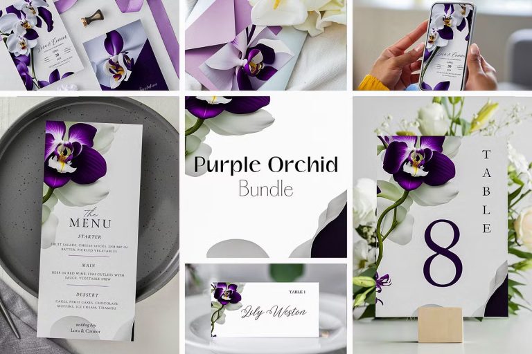
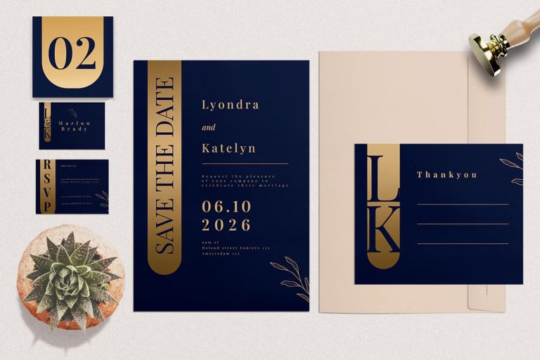
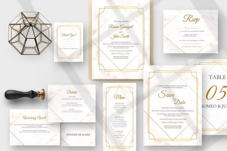
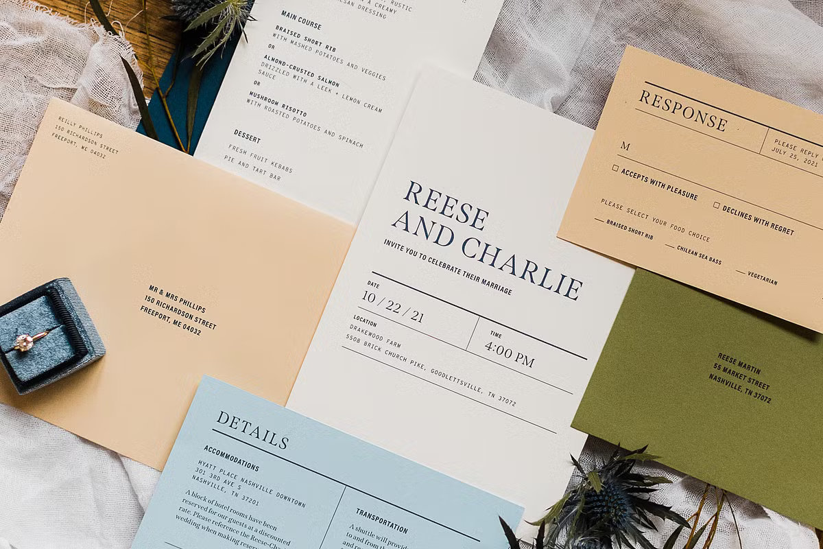
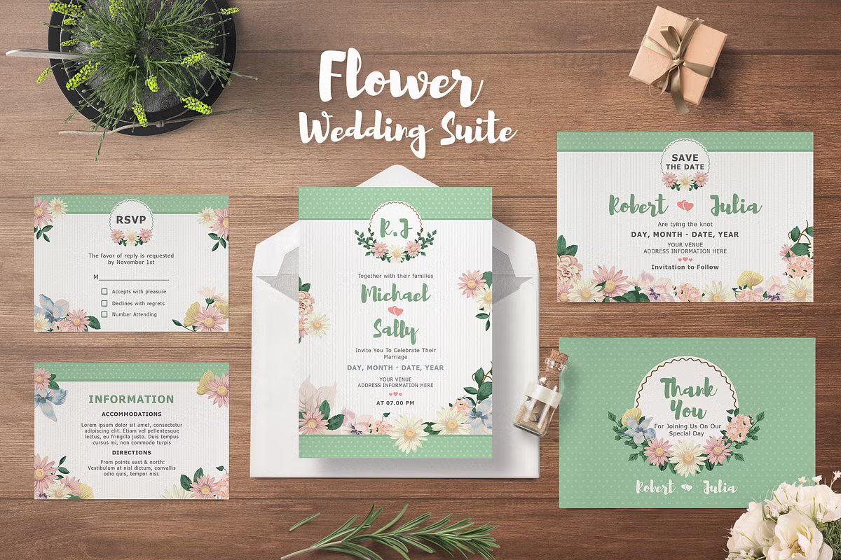
How to Avoid Wedding Invitation Etiquette Mistakes with a Professional Suite. The most frequent faux pas is trying to fit everything—RSVP info, gift registry, and directions—onto a single card. In professional etiquette, this creates “visual noise” and dilutes the elegance of the design.
- The Fix: Use a curated Wedding Suite. Distribute the details across separate enclosure cards (Details, RSVP, and Accommodation) for a clean, organized look.
Mistake #2: Mentioning Gift Registries on the Main Card
Including “We are registered at…” directly on the formal invitation is considered a major etiquette breach. It shifts the focus from the celebration to the gift.
- The Fix: Share registry info on your wedding website or a small, separate “Details” card.
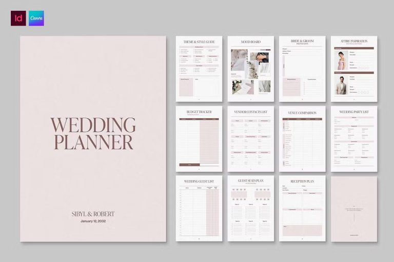
Mistake #3: Missing the RSVP Deadline Clarity
Couples often set the RSVP date too close to the wedding, leading to last-minute stress with catering and seating charts.
- The Fix: Set the deadline 3–4 weeks before the big day. Use a dedicated RSVP card to make it easy for guests to respond promptly.
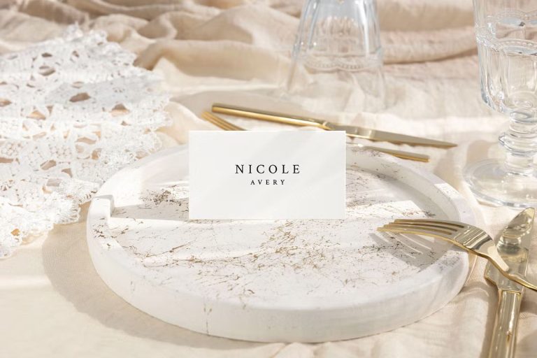
Mistake #4: Incorrect Guest Names and Titles
Understanding these wedding invitation design mistakes helps you choose a suite that feels intentional and high-end. Using “And Guest” for long-term partners or misspelling names can feel impersonal and disrespectful.
- The Fix: Take the time to find out the full names of all plus-ones. Address envelopes formally (e.g., Mr. and Mrs. Smith) for a polished look.
Mistake #5: Sending Invitations Too Late
Waiting until 4 weeks before the wedding to send invites is a recipe for low attendance.
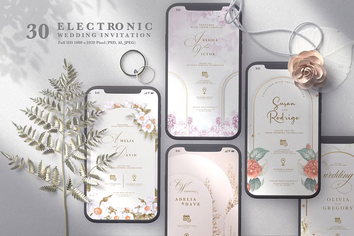
- The Fix: Aim for 6–8 weeks (or 3 months for destination weddings). If you’re short on time, a high-quality Digital Save the Date from Creative Market can save the day.
When time is of the essence, switching to a digital format is a smart and stylish move. High-quality mobile invitation templates allow you to maintain your wedding aesthetic while ensuring instant delivery to your guests
Mistake #6: Using Too Many Different Fonts
Mixing five different fonts on one card creates a cluttered, amateur appearance that clashes with a Minimalist aesthetic.
- The Fix: Stick to two complementary fonts—one elegant Serif and one clean Sans-Serif. Look for Professional Font Duos on Creative Market for a perfect match.
- Remember, readability is just as important as aesthetics when it comes to formal invitations
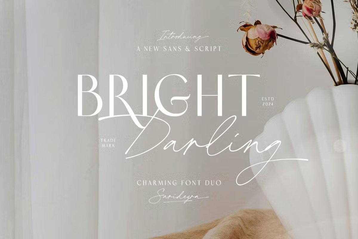
The key to a high-end minimalist look is using a professional font pairing. We recommend choosing a pre-made Wedding Font Duo that balances a romantic script with a clean, timeless serif.
Mistake #7: Forgetting the Envelope Etiquette
A messy or poorly addressed envelope can diminish the excitement before the guest even opens the invite.
- The Fix: Use consistent typography or a custom address stamp.
Conclusion
Focusing on these details and fixing common wedding invitation design mistakes ensures your stationery reflects the true elegance of your celebration. By prioritizing a clean layout, thoughtful timing, and a professional aesthetic, you create a seamless and sophisticated experience for your guests from the very first moment they open the envelope.
For more details on what to write, check our The Ultimate Guide to Wedding Invitation Wording & Etiquette (with Examples)